Dallas, Texas
Web Design
A photography-led marketing site for a luxury Texas home builder — designed in Webflow to let the architecture do the talking.
The Brief
Mattison Reynolds Residential Works is a Hill Country builder known for stone-clad ranches and modern farmhouses. The work sells itself in person, but the existing site was a generic agency template that buried the homes behind stock photography and clip-art icons.
The redesign needed to feel like an architectural monograph dark, photographic, unhurried. Every section had to make the work feel inevitable.
My Role
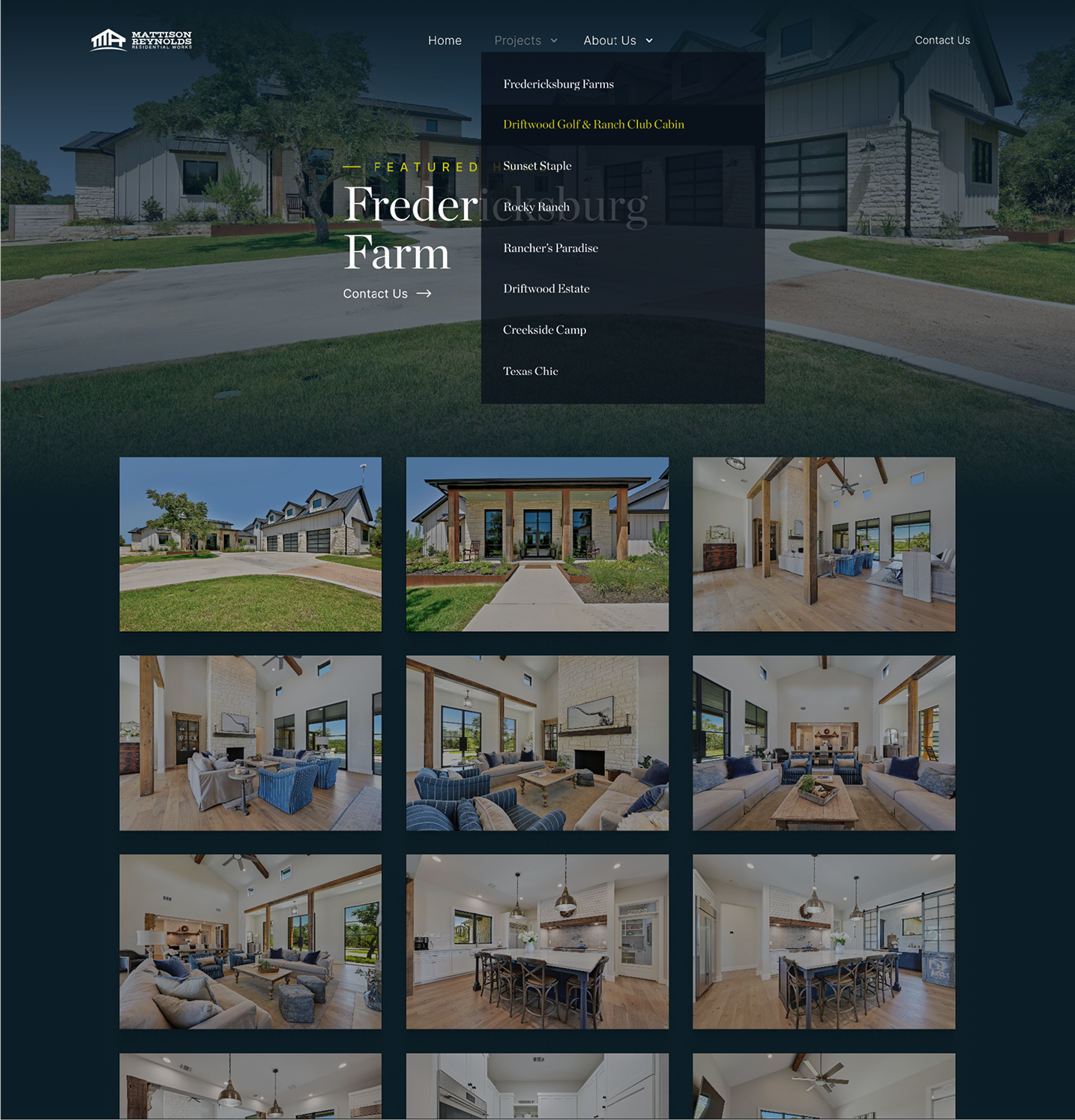
I led the full visual design of the marketing site in Webflow — typography, color, layout, and the responsive system. The builder supplied the photography; my job was to give it a stage.
Design Direction
The whole site rests on four decisions that show up on every page.
A near-black blue anchors the site in the same calm darkness as the photography. Every section sits on it; nothing competes.
A single warm gold handles labels, underlines, and the chapter counters. It's the only second color on the page, which keeps it expensive.
Headlines run in a high-contrast display serif. Body copy stays in a humanist sans. The contrast borrows from print monographs — confident, quiet, not corporate.
Every hero is a single full-bleed photo with a numbered index at the right edge. The architecture is the design — the layout just frames it.
Hero Variations
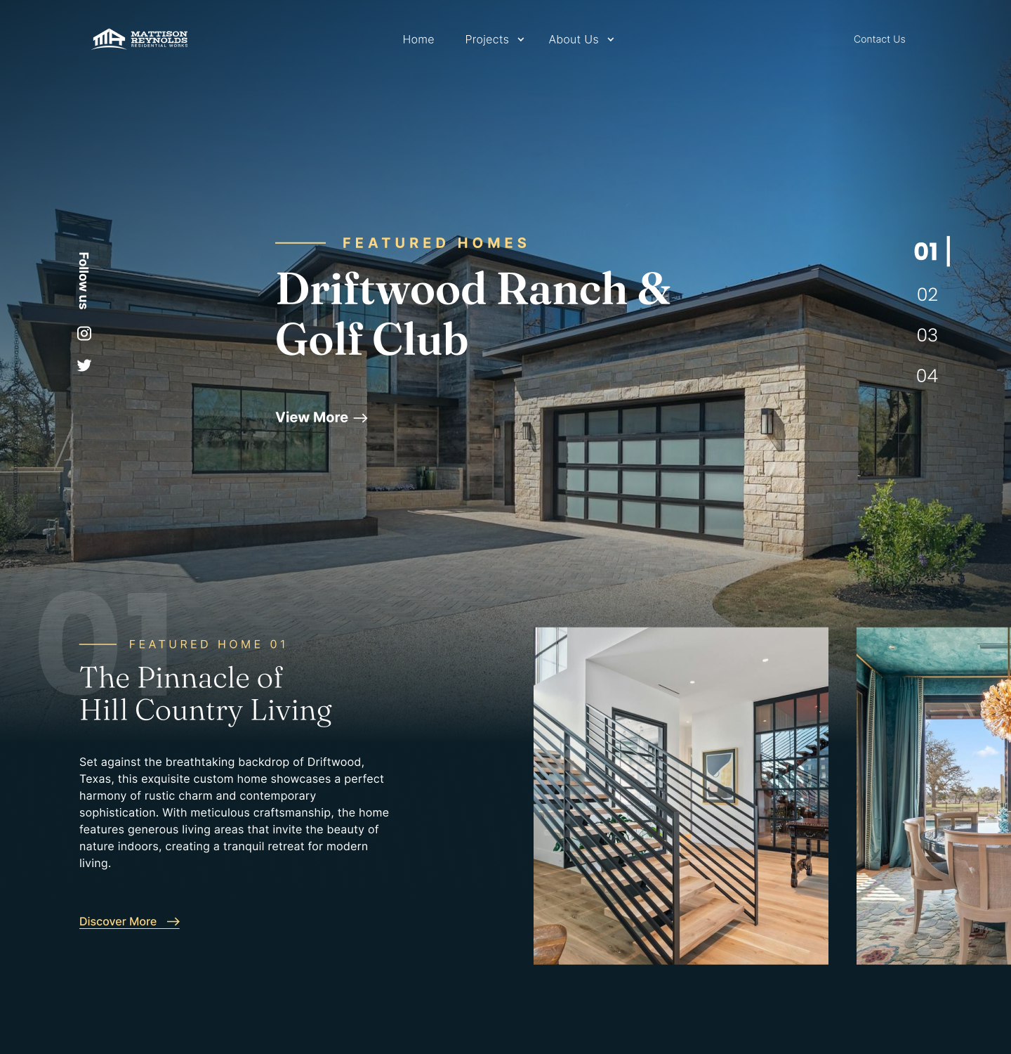
Each home gets a full-bleed exterior shot. The interface — nav, indexing, follow-us rail — sits at the edges so the architecture owns the frame.
The right rail counts 01–04 with the active home highlighted. It works as both a slide indicator and a discreet table of contents for the featured lineup.
A small gold eyebrow above each headline grounds the visitor in where they are on the page. The View More CTA is understated — the photo is the real call to action.
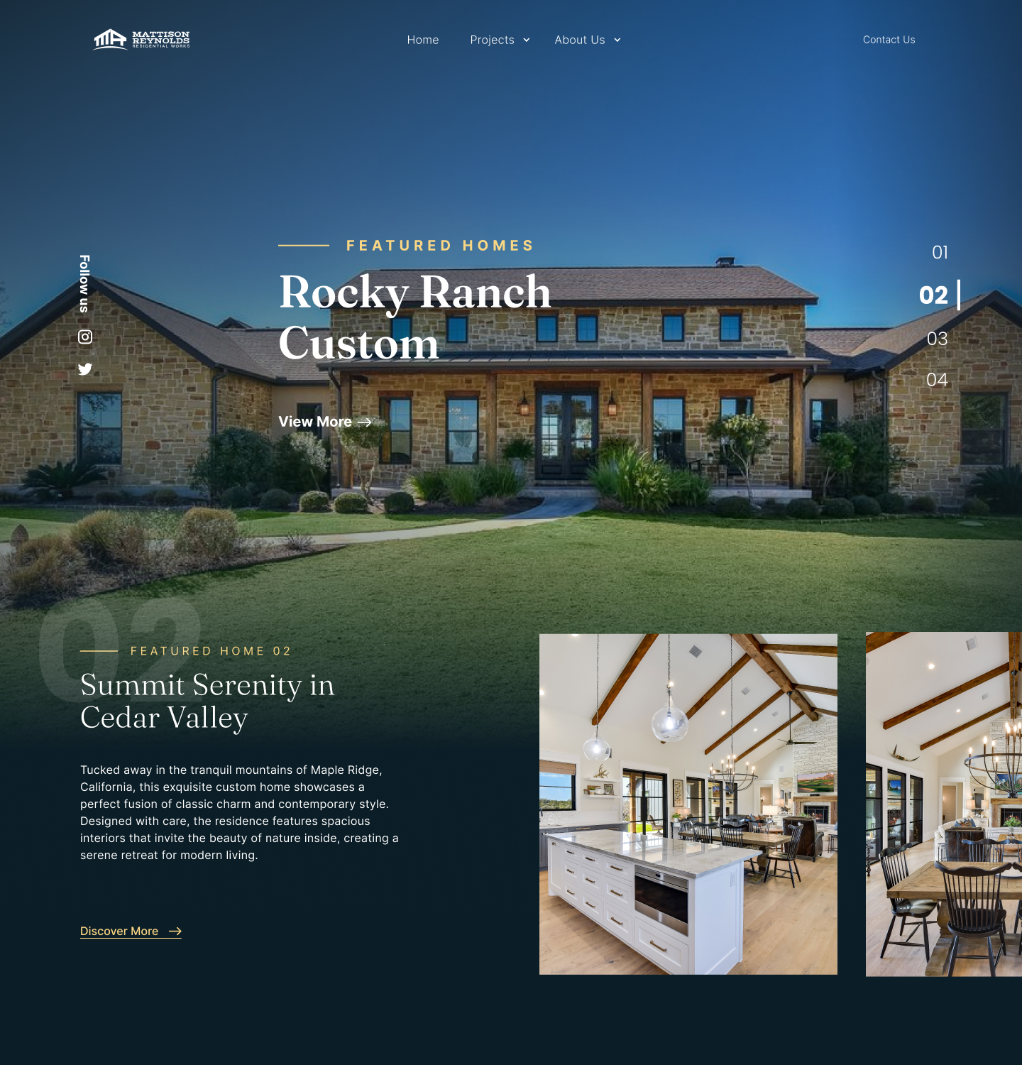
Rocky Ranch leans into warm, dusk-lit stone. The hero crop tightens to make the symmetry of the front elevation read at a glance.
Below the fold, two interior shots — vaulted living room and dining nook — confirm the mood the exterior promised. The pairing logic stays consistent across every home.
Each featured home gets a short evocative title — 'Summit Serenity in Cedar Valley' — paired with a one-paragraph descriptor. The voice is monograph, not marketing-copy.
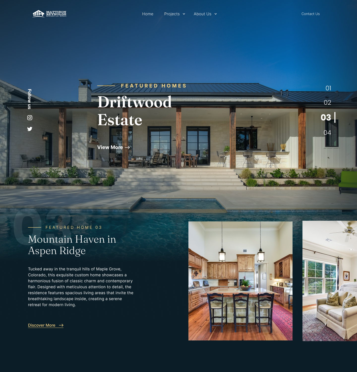
Driftwood Estate centers on the pool reflection. The numbered index slides to 03; the rest of the page composition stays exactly the same.
Every home reuses the same hero template — same type sizes, same edge rail, same eyebrow placement. The variation is the photography, not the layout.
Home, Projects (with dropdown), About Us, and Contact stay in the same positions on every page. Visitors never relearn the nav after scrolling through a home.
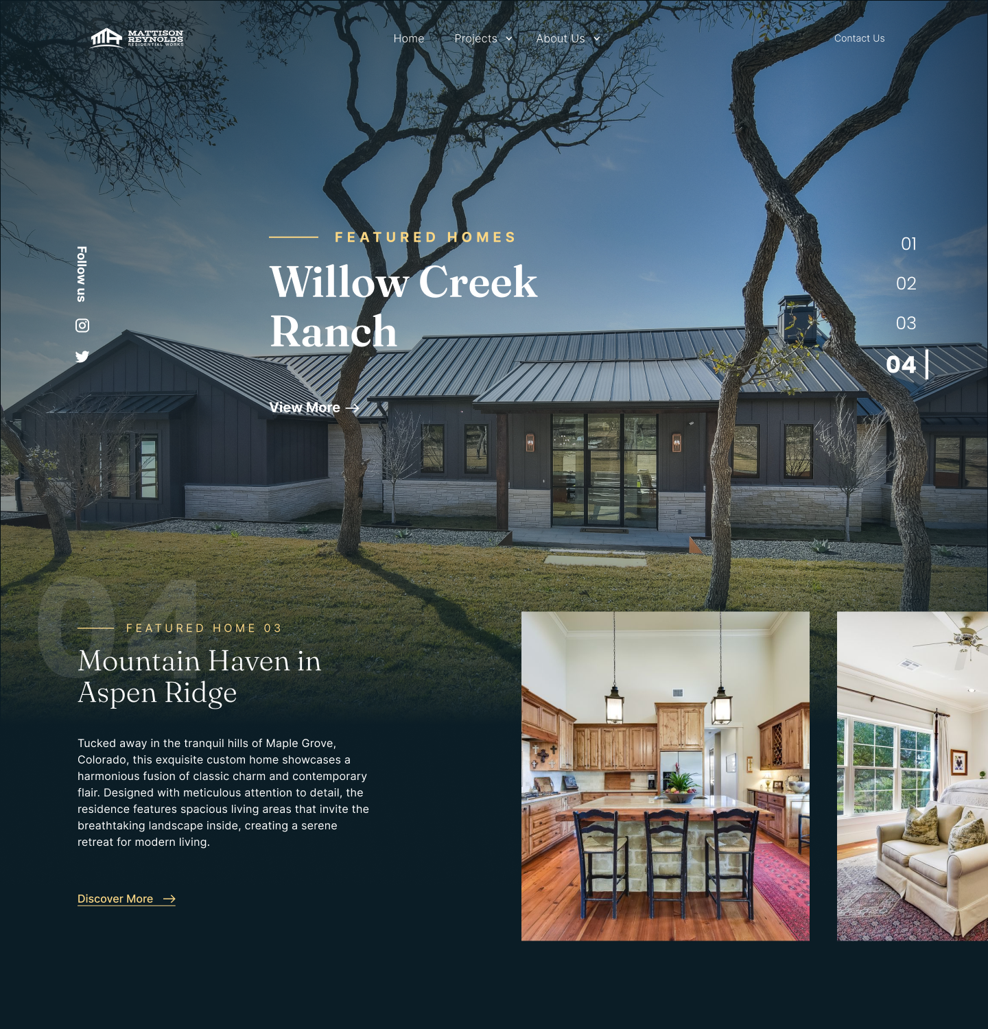
Willow Creek leans into the framing oaks — the tree silhouettes become part of the layout. The hero crop is the same width, but the negative space carries weight.
A large translucent numeral '04' overlaps the section break. It reinforces the index on the right rail without repeating the same visual treatment.
The 'Mountain Haven in Aspen Ridge' descriptor below the hero echoes the magazine-style title-and-deck rhythm used on every featured home.
Project Gallery
Each home gets its own gallery page: a 3-column grid of exterior, interior, and detail shots. The nav surfaces the full project list on hover so visitors can jump between homes without losing context.
What I'd Explore Next
A few decisions I would revisit with more time or with usage data from the live site.
The hero photography is the experience, but it's also a lot of pixels. I'd want to measure LCP on a mid-tier mobile connection and decide whether to add a progressive blur-up load.
Contact Us currently sits only in the top-right nav. With usage data, I'd test surfacing a contextual contact CTA right under each featured home — visitors are most interested right after seeing a specific house.
The site leans heavily on imagery. I'd add a subtle caption layer for project shots — useful for screen readers and a nice layer of architectural context for sighted visitors too.
Reflection
When the work is this photogenic, the design's job is to disappear. Generous spacing, a single typeface pairing, and a tight color palette let the homes carry the page.
Webflow forced clarity on the component system early — every section had to be named, reusable, and responsive. The constraint made the final site more cohesive than a from-scratch build would have been.