
Case Study
A real-time flight companion that pulls search, live tracking, maps, and airport info out of five different apps and into one calm, glanceable experience.
The Hook
Checking a flight today means bouncing between the airline's app, a tracking site, the airport's site, and a maps app for the drive. Each one has its own login, its own layout, and its own idea of what matters. None of them tell the full story at a glance.
SkyPath's goal was to bring all of it, search, live status, maps, timelines, and alerts, into one focused app that feels calm even when a flight doesn't go as planned.
My Role
This was a self-directed project. I designed the end-to-end experience alone, from information architecture through high-fidelity UI, covering the moments that matter most before, during, and after a flight: searching, tracking, and getting to the gate.
The Problem
Flying has no shortage of tools, it has too many of them. We identified four core problems dragging the experience down.
Flight status lives in one app, boarding passes in another, and gate maps in a third. Travelers stitch together their own picture of the day.
Real delay and gate information is often several taps deep, right when a traveler needs it in one glance.
Dense tables and jargon-heavy screens make an already stressful moment feel more stressful.
Terminal maps, security wait times, and gate walk times are rarely surfaced where and when they're actually needed.
The Full Flow
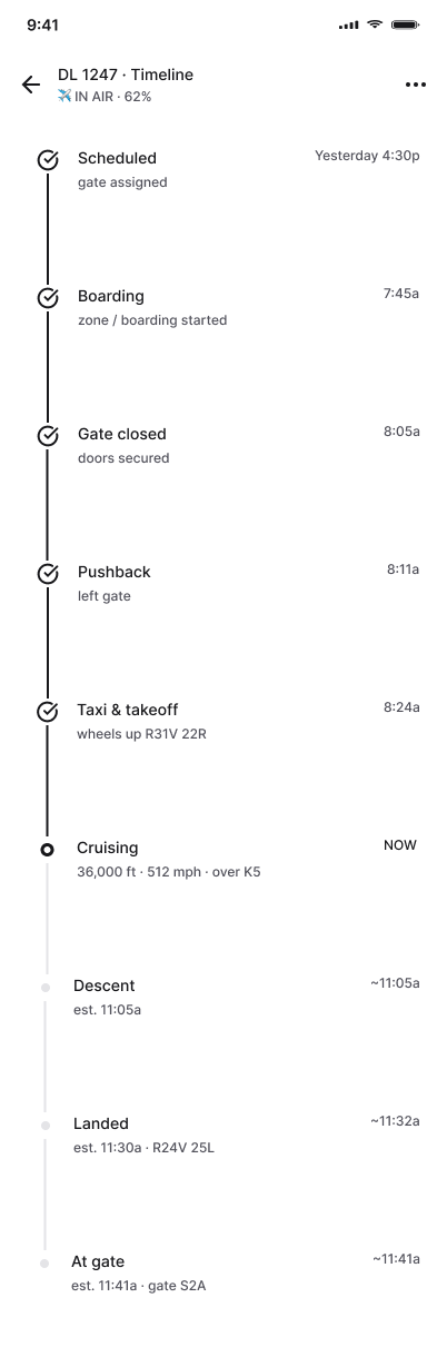
Scroll through every screen in sequence, from opening the app to watching a flight land, to see how SkyPath keeps every step calm and clear.

Design Decisions
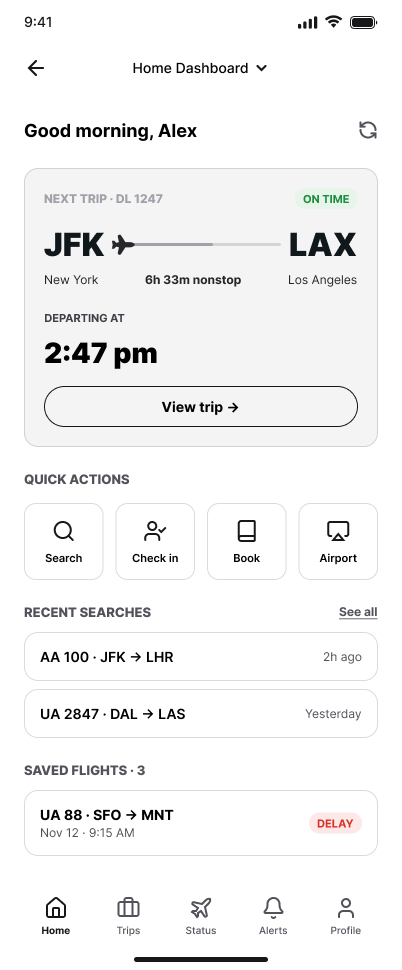
The next trip card leads with flight number, route, and a live status badge, so travelers know where they stand before reading a single word.
Search, Check in, Book, and Airport sit in one row of quick actions, covering the four things travelers reach for most.
Recent searches and saved flights carry over automatically, so checking the same flight twice never means starting from zero.
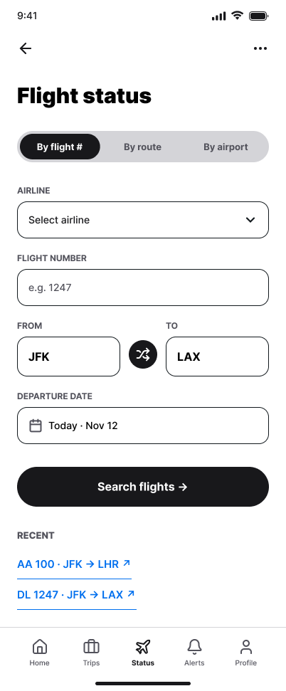
By flight number, by route, or by airport, three tabs cover the three ways travelers actually look up a flight, instead of forcing one rigid form.
A single swap icon flips origin and destination instantly, useful for checking both legs of a round trip without retyping anything.
Past lookups sit below the fold, ready to reopen without re-entering an airline, flight number, or date.
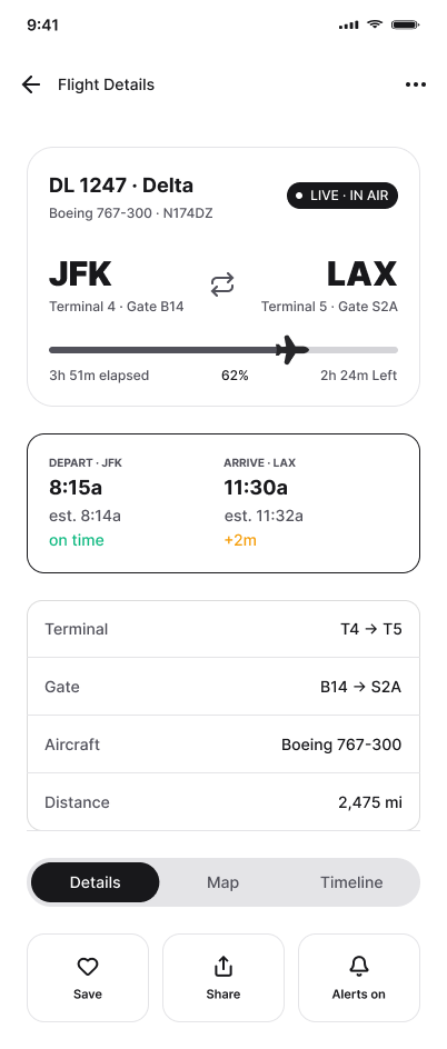
A live progress bar shows elapsed and remaining flight time at a glance, with a plane icon marking real position along the route.
Departure and arrival terminals and gates sit in one row so a traveler can plan the walk on both ends before landing.
Save, Share, and Alerts sit together at the bottom, turning a details screen into something a traveler actually acts on.
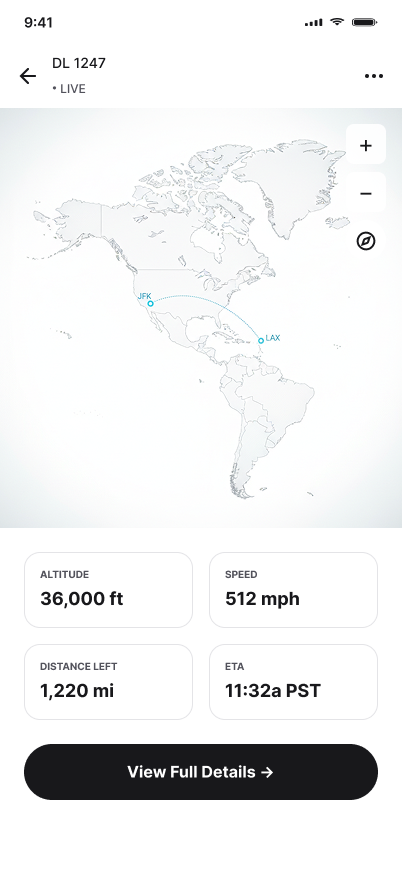
A live map with a dotted arc between origin and destination turns an abstract flight number into a route you can actually picture.
Altitude, speed, distance left, and ETA are shown as four simple stats instead of buried in a technical readout.
Standard map controls, plus a compass reset, let travelers explore the route without ever losing track of where the flight actually is.
Supporting Screens
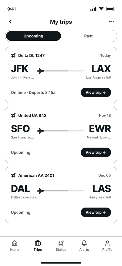
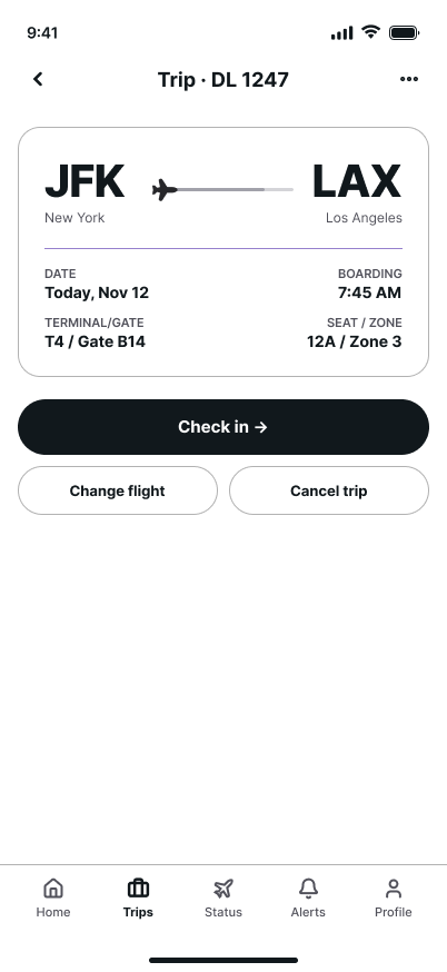
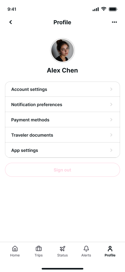
Beyond the core search-and-track flow, SkyPath needed screens for airport logistics, trip management, and account settings. Each carries the same calm visual language established in the primary screens.

What I would Test Next
Because this is a personal, unshipped project, I'd want to validate three things with real travelers.
Do By flight #, By route, and By airport read clearly as three paths to the same result, or would travelers expect one smart search bar instead?
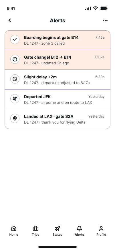
How much lag between an actual gate change and what SkyPath shows is acceptable before travelers stop trusting the live badge altogether?
Does the live map's altitude, speed, and route information hold up for low-vision users, or does core tracking need a non-visual equivalent?
What I Learned
Flight tracking apps get used at some of the most stressful moments of a trip. This project taught me that calm isn't just an aesthetic choice, it's a functional requirement: clear hierarchy, generous spacing, and status color coding do more for a traveler's peace of mind than any amount of polish.
It also reinforced the value of a tight, reusable design system. Building one flight card, one status badge, and one phone frame pattern early made it possible to cover 13 screens, from splash to profile, without the experience ever feeling inconsistent.