Dallas, Texas
Case Study
Rebuilding a cultural icon's mobile experience from the ground up, so the app finally feels like walking into a Fridays.
The Hook
TGI Fridays has been a cultural institution since 1965, but its mobile app told a different story. The existing experience felt generic, visually dated, and disconnected from the brand's signature energy. Ordering was cumbersome, the loyalty program was buried, and nothing about it felt like Fridays.
Our goal was to rebuild it from the ground up: an app that finally matched the brand.
My Role
I was the UI designer on this project during my internship, working in close collaboration with a UX researcher. My research partner led user interviews and synthesized findings into key insights. I owned the visual design direction, component design, and interactive prototype, translating research insights into a cohesive, brand-forward mobile experience across iOS.
The Problem
Research confirmed what users already felt: the app didn't earn their trust or their repeat visits. We identified four core problems dragging the experience down.
The design felt generic and off-brand, with no connection to the Fridays identity people know in person.
The rewards system wasn't prominent enough to drive engagement or give members a reason to come back.
The ordering flow added friction at every step, making what should be simple feel like work.
The overall tone failed to reflect what Fridays actually feels like as a brand. It could have been any restaurant.
The Full Flow
Scroll through every screen in sequence to see how the redesigned experience flows from first launch to repeat ordering.
.png)
.png)
.png)
.png)
Design Decisions
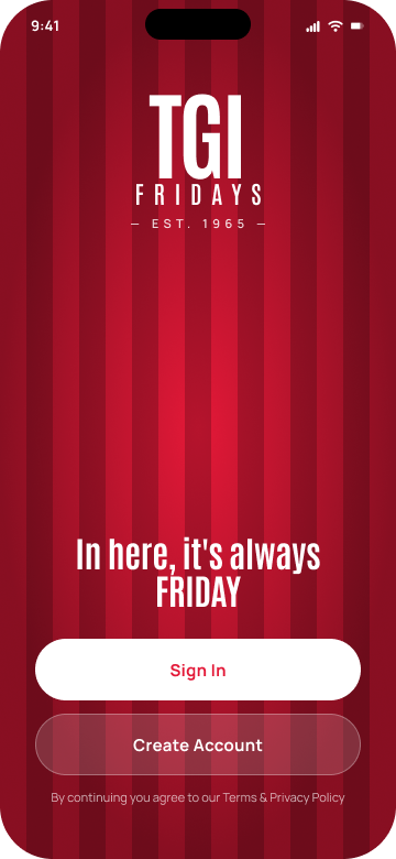
The entry point needed to feel like walking into a Fridays. We leaned into the signature red and stripe motif with a full-bleed immersive screen. No generic splash page. The brand hits you immediately.
The tagline sets the tone from the first frame. This is not a utility app, it is an experience. The copy signals personality before the user even taps anything.
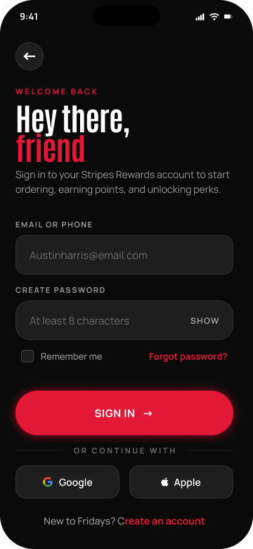
Sign In gets the high-contrast treatment for returning users. Create Account sits below in an outlined style, establishing a visual priority that guides new vs. existing users without confusion.
Instead of a standard dropdown, we reframed order mode selection as a personality moment. Pick Your Vibe uses the brand voice while keeping the interaction clear and low-friction.
The map and Use Current Location CTA reduce the number of taps before ordering. Location context is set once and carries through the rest of the session.
Pickup, Delivery, and Dine-in are presented as radio-style cards with estimated times and fees visible upfront. Users make one decision here instead of navigating through multiple screens.
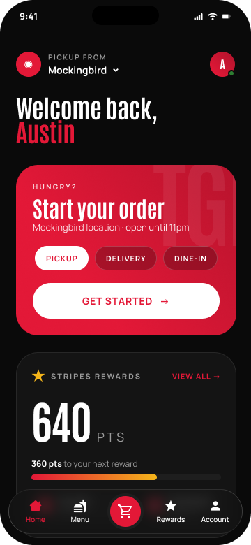
Welcome back Austin with the selected pickup location creates a sense of recognition. The user feels known, not anonymous. A small copy decision that changes the entire emotional register of the screen.
The home screen was designed around a single priority: get the user to their next order fast. The hero card surfaces location, hours, and all three order modes with a prominent Get Started CTA.
Rewards points are surfaced immediately above the fold so members always know how close they are to their next perk. The progress bar makes earning feel tangible without requiring a separate screen visit.
The existing loyalty experience was effectively invisible. We made the points balance the largest element on the screen, presented in a bold red card that feels worth paying attention to.
360 pts to free entree, keep going combines a visual progress bar with encouraging copy. The user can see exactly where they stand and what they are working toward.
Each reward tier shows the point threshold and a Redeem button when eligible. The goal was to make earning feel tangible and redeeming feel easy, reducing the gap between accumulating points and actually using them.
Supporting Screens
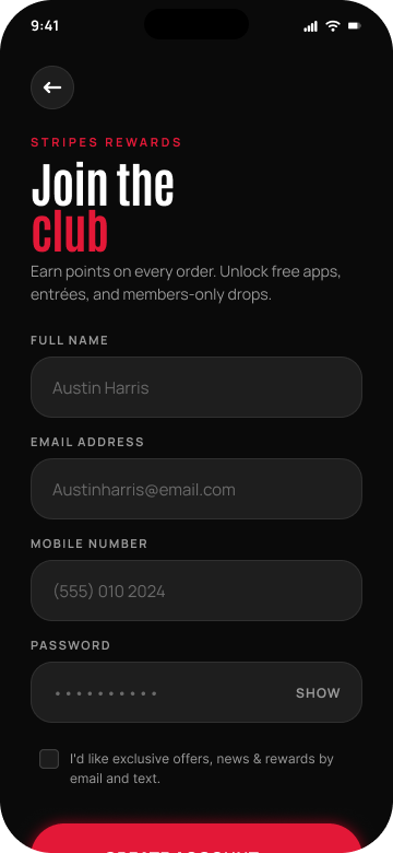
Beyond the core flow, we designed screens for sign in, sign up, the full menu, and account management. Each maintains the same visual system and brand voice established in the primary screens.
What I would Test Next
Because this project did not ship, I would want to validate three things with real users.
Does the reframed order mode selector resonate with users, or does the playful language cause confusion? The brand voice is intentional, but it needs to pass the real-world usability test.
How prominently do rewards need to be surfaced on the home screen before they meaningfully change repeat order behavior? Is above-the-fold enough, or does it need to be even more aggressive?
Does the dark theme hold up in outdoor or high-ambient-light environments where restaurant app usage is common? Contrast ratios pass WCAG on paper, but real-world readability is a different test.
What I Learned
This project taught me how much brand voice belongs in UI copy, not just visuals. Small language decisions changed the entire feel of the experience without changing a single component.
It also reinforced how much a strong design system pays off: because we established a consistent token set early, maintaining visual cohesion across 8+ screens was manageable even under time pressure.